Where I’ve Been: Analyzing Ten Years of Google Location History with R
Location history data
Updated 5-Jun-2025
I’ve been using Google Location History ever since switching to an Android device in mid-2016. Many people, understandably concerned about their privacy or just plain creeped out by the concept, turn location history off, but I appreciate the way it effortlessly creates a record of my days. It’s like an auto-generated diary that eliminates the hassle of having to write down your deeds by hand.
It’s pretty easy to view your history at https://timeline.google.com/, but I wanted to export my data, analyze it, and create some custom plots.
Exporting your data yields a series of deeply nested .json files. They can be tricky to work with, but fortunately volunteers have provided helpful and extensive documentation at https://locationhistoryformat.com/.
For the sake of readers who might be interested in replicating these plots with their own Location History data, I’ve included my R code in this post. We’ll start by loading necessary packages and then importing the data.
### import necessary packages

library(jsonlite)
library(tidyverse)
library(sf)
library(tigris)
library(ggrepel)
library(rnaturalearth)
library(rnaturalearthdata)
library(plotly)
library(lutz) # for time zones
library(viridis) # for nice graph colors
Rather than a single convenient file, Google generates Location History .json files for each month, so we’ll need to piece them together for the purposes of this anaylsis:
### load the data

# loop through each folder in the directory
for(i in list.files("Location History (Timeline)/Semantic Location History/")){

  # loop through the files in each folder
  for(j in list.files(paste0("Location History (Timeline)/Semantic Location History/", i))){

    # paste together the full file path
    file <- paste0("Location History (Timeline)/Semantic Location History/",i, "/", j)

    # import individual json files
    place_visits_raw_temp <- read_json(file) %>% pluck("timelineObjects") %>% purrr::map("placeVisit") %>% compact()

    # convert the json to a tibble
    place_visits_temp <- place_visits_raw_temp %>% purrr::map(~{
      tibble(
        id = .x$location$placeId,
        latitudeE7 = .x$location$latitudeE7 / 1e7,
        longitudeE7 = .x$location$longitudeE7 / 1e7,
        name = .x$location$name,
        address = .x$location$address,
        startTimestamp = ymd_hms(.x$duration$startTimestamp, tz = "UTC"),
        endTimestamp = ymd_hms(.x$duration$endTimestamp, tz = "UTC")
      )
    }) %>% list_rbind() %>% mutate(duration = endTimestamp - startTimestamp) %>% st_as_sf(coords = c("longitudeE7", "latitudeE7"), crs = st_crs("EPSG:4326"))

    # merge each tibble with all the data we've loaded so far
    places <- rbind(places, place_visits_temp)

  }
}
Visits over time
I’ll start by visualizing my visits over time. First, we’ll tidy up the data and create some useful date- and time-related helper variables.
### creating time-related variables

# create year, month, day, and day of the week variables from "startTimestamp"
places <- places %>% mutate(year = year(startTimestamp), month = month(startTimestamp), day = day(startTimestamp), weekday = factor(weekdays(as.Date(places$startTimestamp)), levels=c("Monday", "Tuesday", "Wednesday","Thursday","Friday","Saturday","Sunday")))

# this data spans multiple timezones, but all time is UTC
# let's convert UTC time to local time based on geography
places <- places %>%  mutate(tz = tz_lookup(., method = "accurate")) %>% mutate(timestamp = ymd_hms(startTimestamp, tz = "UTC")) %>% group_by(tz) %>%
  mutate(timestamp_local = force_tz(with_tz(timestamp, tz), "UTC")) %>%
  ungroup() %>% mutate(time_of_day = format(ymd_hms(timestamp_local), "%H:%M:%S"))
Like most people, I stayed home a lot more during the pandemic, and I imagine that’s reflected in the data. Below, I plot the number of places I visited per month:
### plot visits by month

places %>% filter(as.Date(startTimestamp)<="2024-04-30"&as.Date(startTimestamp)>="2016-07-01") %>%
  mutate(year_month = as.Date(paste(year, month, "01", sep="-"))) %>%
  group_by(year_month) %>%
  dplyr::summarise(count = n()) %>%
  ggplot(aes(x=year_month, y=count)) + geom_line() + labs(title = "Place visits by month", x = "Date", y = "Number of places visited") + geom_vline(xintercept=ymd("2020-03-01"), linetype="dashed", color="red") + annotate("rect", xmin = ymd("2020-03-01"), xmax = ymd("2021-06-17"), ymin = -50, ymax = 250, alpha = 0.2, fill = "grey") + geom_vline(xintercept=ymd("2021-06-17"), linetype="dashed", color="red") + coord_cartesian(ylim = c(0,200)) + theme_bw()

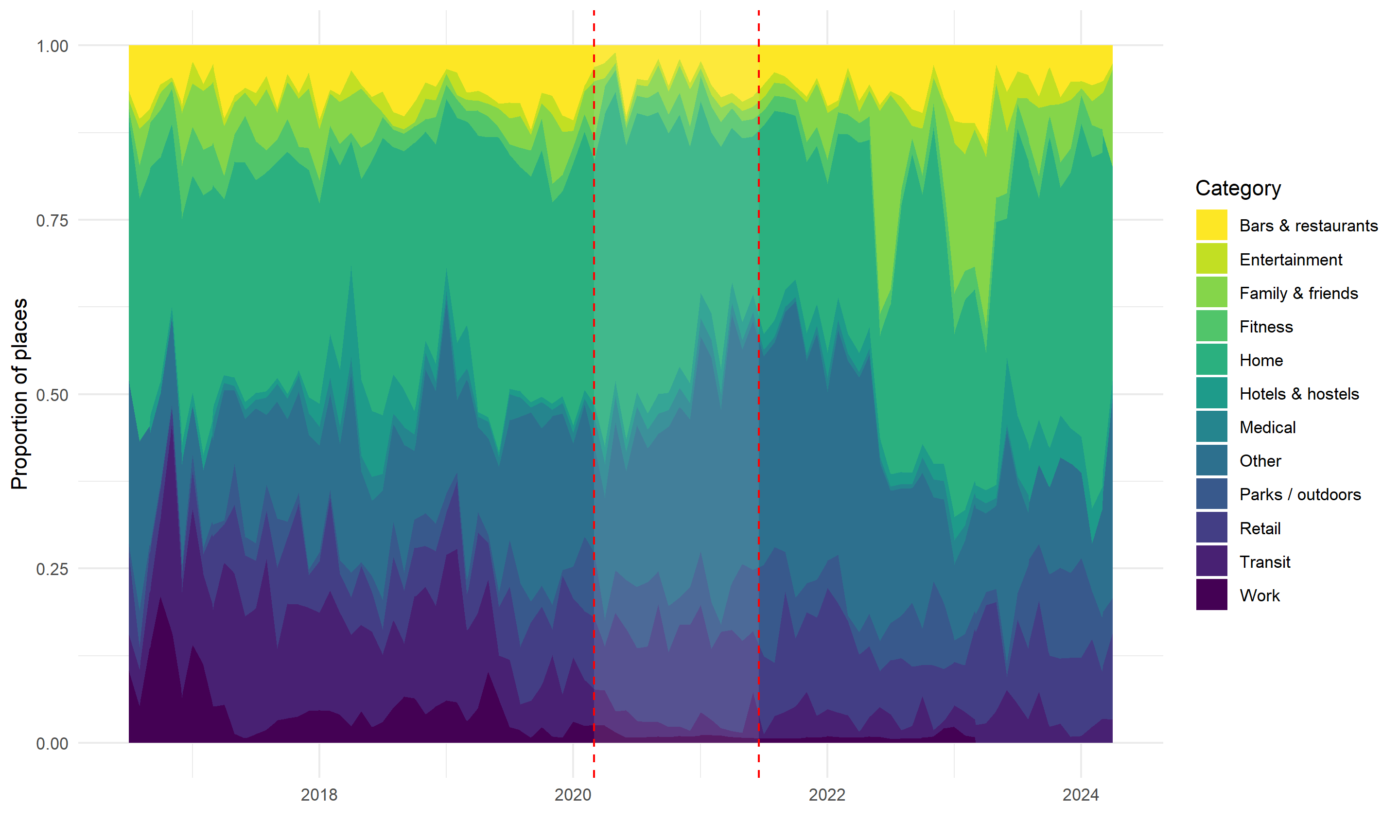
There’s definitely a visible dip between March 2020 (when U.S. lockdowns began) and June 2021 (when I was fully vaccinated). Besides overall visits, I wondered whether I would see any pandemic-related trends in terms of the kinds of places I tended to visit. Google does a pretty good job of filling in the names for places you visit, but it doesn’t get them all right, and obviously it can’t name residential addresses for you. Offscreen, I used dplyr::case_when to create a category variable. Let’s use it to plot my visits by category over time:
### plot category proportion over time

places %>% as.data.frame %>% filter(as.Date(startTimestamp)<="2024-04-30"&as.Date(startTimestamp)>="2016-07-01") %>%
  mutate(year_month = as.Date(paste(year, month, "01", sep="-"))) %>%
  group_by(year_month, category) %>%
  dplyr::summarise(visits = sum(n())) %>%
  ggplot(aes(x=year_month, y=visits, fill=category)) +
  geom_area(position=position_fill()) +
  theme_minimal() + xlab("") + ylab("Proportion of places") + guides(fill=guide_legend(title="Category")) +
  scale_fill_viridis(discrete = T, direction=-1) + annotate("rect", xmin = ymd("2020-03-01"), xmax = ymd("2021-06-17"), ymin = -0, ymax = 1, alpha = 0.1, fill = "white") + geom_vline(xintercept=ymd("2020-03-01"), linetype="dashed", color="red") + geom_vline(xintercept=ymd("2021-06-17"), linetype="dashed", color="red")

I don’t know that this view offers too many new insights, but the proportion of my visits that were “home” definitely increased and the proportion that were “bars & restaurants) definitely decreased during the initial phase of the pandemic. Separately, you can see a couple of spikes in mid-2022 and early 2023 when I paid friends & family extended visits.
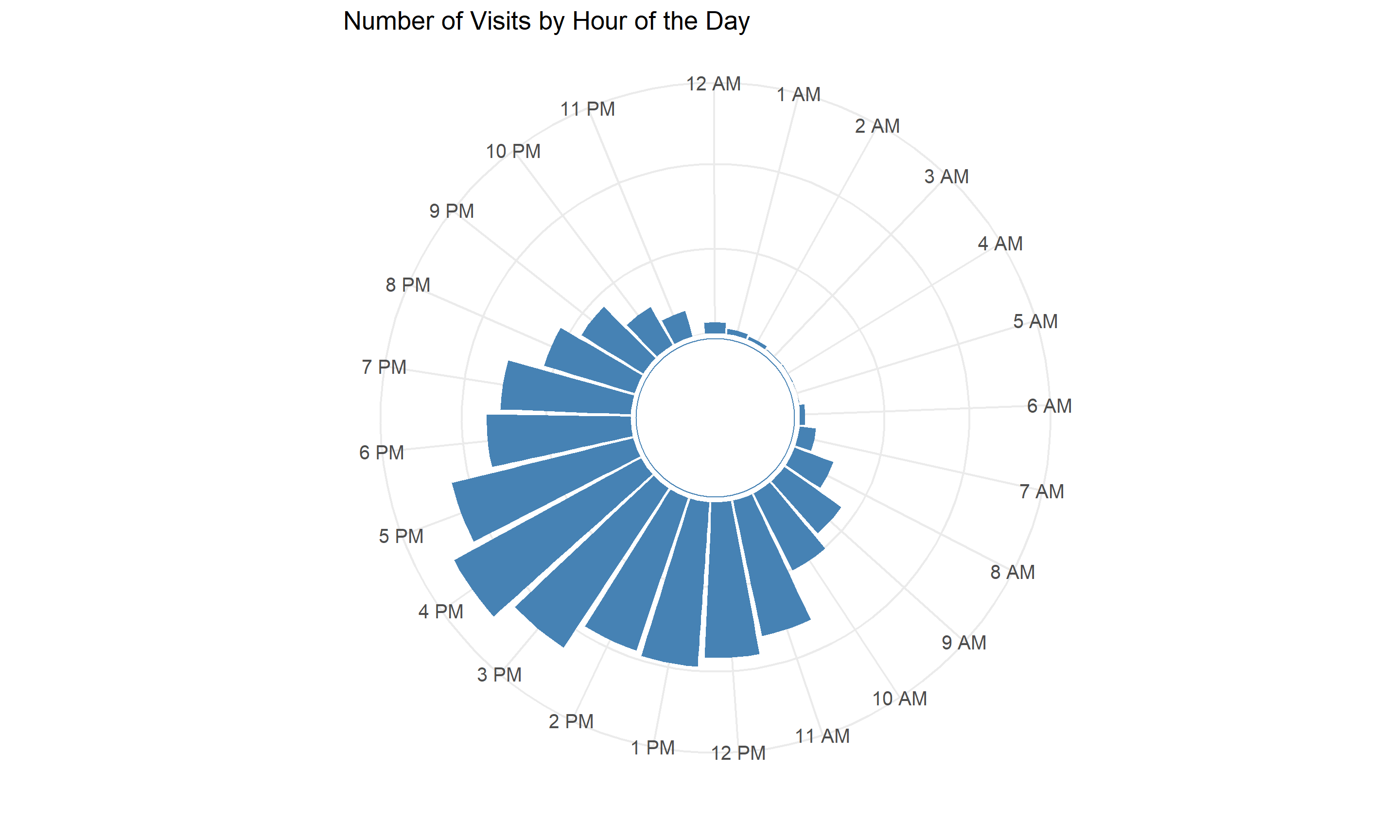
I was curious about what other time-related patterns might appear in the data. Chi-squared tests reveal–somewhat predictably–that the number of places I visit varies significantly based on day of the week and month of the year (I tend to visit more places during the warmer months and on weekends). I also visualized my visits by hour:
### plot visits by hour

places %>%  mutate(hour = hour(hms(time_of_day))) %>%
  group_by(hour) %>%
  dplyr::summarise(visits = n()) %>%
  drop_na() %>%
  ggplot(aes(x=factor(hour), y=visits)) +
  geom_col(fill="steelblue") +
  ylim(-500,1260) +
  theme_minimal() +
  coord_polar(start=-pi/12) +
  scale_x_discrete(breaks = 0:23, labels = c("12 AM", "1 AM", "2 AM", "3 AM", "4 AM", "5 AM", "6 AM", "7 AM", "8 AM", "9 AM", "10 AM", "11 AM", "12 PM", "1 PM", "2 PM", "3 PM", "4 PM", "5 PM", "6 PM", "7 PM", "8 PM", "9 PM", "10 PM", "11 PM")) + labs(title = "Number of Visits by Hour of the Day", x = "", y = "") +
  theme(legend.position="none", axis.text.x = element_text(size = 10, angle = 0, vjust = 0.5, hjust=1), axis.text.y = element_blank(), axis.ticks.y = element_blank(), aspect.ratio = 1) +
  annotate("rect", xmin = -Inf, xmax = Inf, ymin = -Inf, ymax = 0, fill = "white") +
  annotate("point", x = 0, y = -500, size = 38, shape = 21, fill = "white", color = "steelblue") +
  annotate("text", x = 0, y = 0, label = "", size = 20)

Very reasonably, the bulk of my activity occurs between 11 AM and 7 PM, with virtually no activity recorded between the wee hours of midnight to 7 AM.
Plotting my location
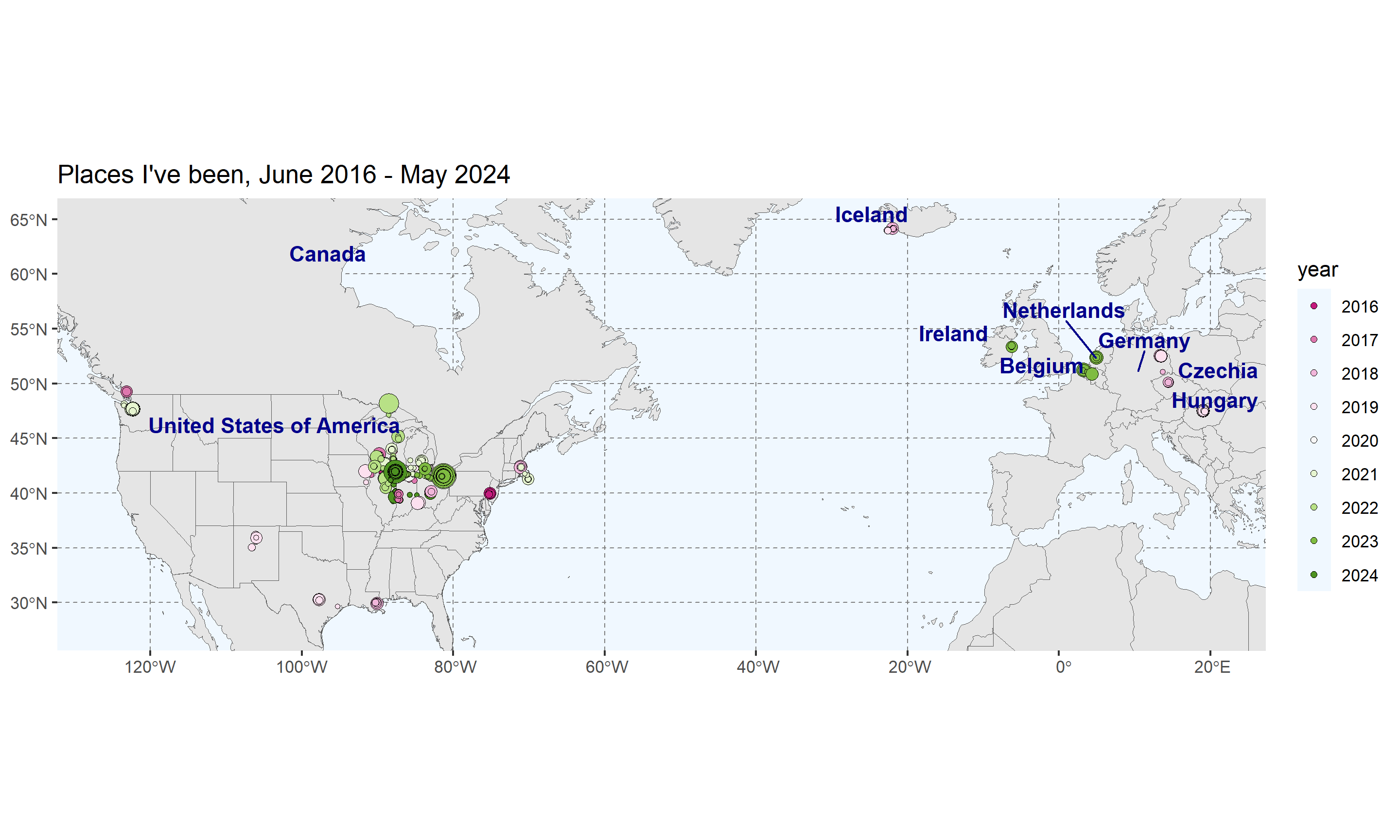
More than anything else, I wanted to create a nice little visualization of all the places I’ve been. I added a little additional information to the plot to make it more interesting: each point’s color indicates the recency of the visits (with green points being more recent, and red points being longer ago), and each each point’s size indicates the duration of a visit (larger points indicate longer durations).
### set up and display all visits

# first, load shapefiles for the U.S. (so we can break out individual states) and the world
world <- ne_countries(scale = "medium", returnclass = "sf")
us_states <- states(resolution = "20m", year = 2022, cb = TRUE)

# let's create some labels for the countries I visited
world_points <- st_centroid(world)
world_points <- cbind(world, st_coordinates(st_centroid(world$geometry))) %>% filter(continent=="Europe"|continent=="North America") %>% filter((name_en %in% c("United States of America", "Ireland", "Iceland", "Canada", "Germany", "Belgium", "Netherlands", "Czech Republic", "Hungary")))

# next, we'll define a narrower trip window -- we don't need to see the *whole* world
trip_window <- st_sfc(
  st_point(c(-125.000, 27.5)),  # left (west), bottom (south)
  st_point(c(20.000, 65.000)),   # right (east), top (north)
  crs = st_crs("EPSG:4326")
) %>%
  st_coordinates()

# convert 'year' to a factor for plotting purposes
places$year <- as.factor(places$year)

# finally, we'll set up and display the plot
all_visits <- ggplot() + geom_sf(data = world) + geom_sf(data = us_states, fill=NA) + theme(panel.grid.major = element_line(color = gray(.5), linetype = "dashed", size = 0.25), panel.background = element_rect(fill = "aliceblue")) + geom_sf(data = places, aes(fill=year, size=as.numeric(duration),  text = paste(
  "Year: ", year, "<br>",
  "Duration (minutes): ", round(as.numeric(duration), digits=0), "<br>"
)), shape=21, stroke=.25, color="black"
) + scale_fill_brewer(palette = "PiYG") +
  coord_sf(
  xlim = trip_window[, "X"],
  ylim = trip_window[, "Y"]) + ggtitle("Places I've been, June 2016 - May 2024") + geom_text_repel(data= world_points,aes(x=X, y=Y, label=name), color = "darkblue", fontface = "bold", check_overlap = TRUE, nudge_y=1.5) + guides(size="none") + theme(axis.title.x=element_blank(), axis.title.y=element_blank())
all_visits

Very nice! You can see that the bulk of my activity is confined to the Midwest, particularly Illinois (I live in Chicago) and Ohio (where I’m from); I also spent a fair amount of time exploring Wisconsin and (to a lesser extent) Michigan and Indiana.
Finally, I created an interactive version of this plot that allows you to pan, zoom, and filter by year. Feel free to explore my timeline yourself:
Interactive (plotly) plot
Conclusion
There’s a wealth of data contained in your Google Location History. I think it’s pretty understandable to be concerned about how it might be used–and maybe silly to leave it on unless you’re going to use that data yourself! If you start poking around, though, there’s a lot you can learn about your own habits and patterns. I’ve only scratched the surface in these analyses, and I’ll likely keep digging!

